Data Visualization Series I: Creating a Map in R
2016-03-04
There are many visualization methods, such as scatter plot, line, area, dimension, box, etc.
Today, we look at how to make a geographical map and colored the regions according to variable values, and then make an animation.
- First, we can use a package maps to make a map.
library(maps)

map("world", fill = TRUE, col = rainbow(200),
    ylim = c(-60, 90), mar = c(0, 0, 0, 0))
title("World Map")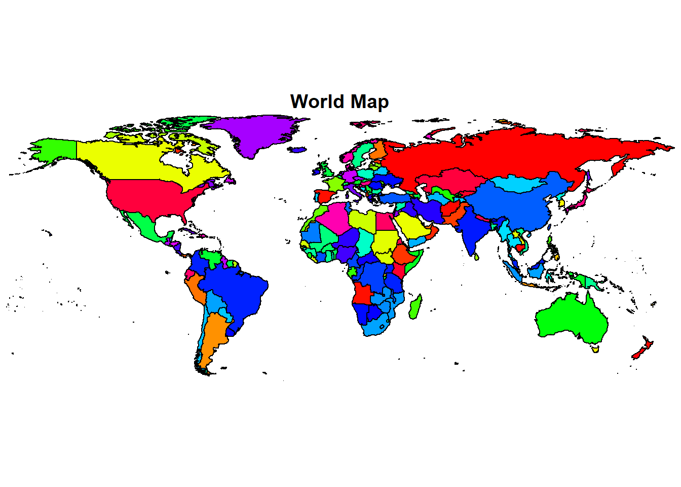
map("state", fill = TRUE, col = rainbow(209),
    mar = c(0, 0, 2, 0))
title("USA Map")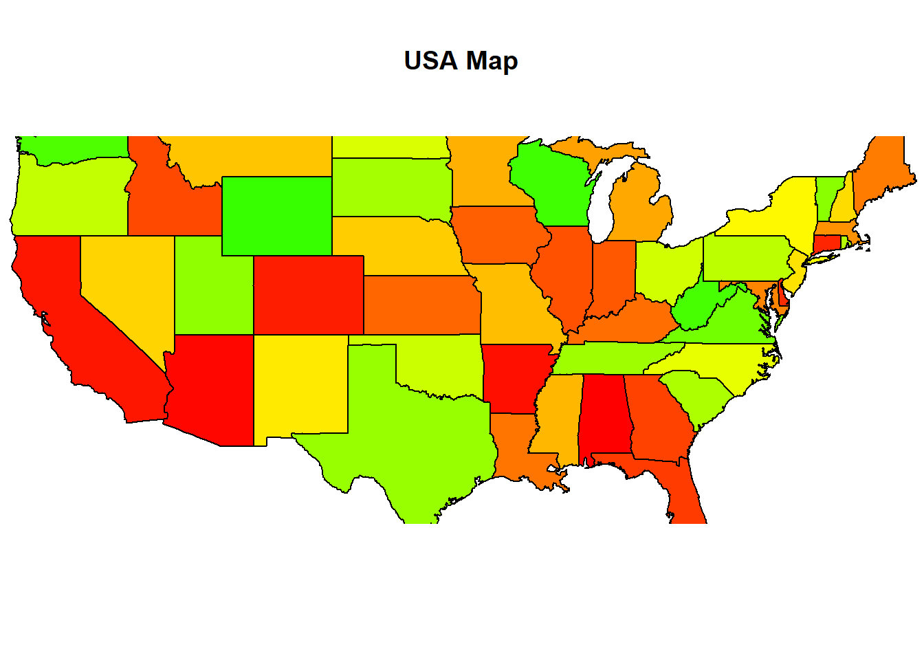
- Second, we can use a package ggplot2.
This package is created by Hadley Wickham, a famous data scientist in RStudio.
It could get map data from package maps, then draw the map by itself.
library(ggplot2)

# create a data frame of map data
states_map <- map_data("state")
# get map
ggplot(states_map, aes(x = long, y = lat, group = group)) +
  geom_polygon(fill = "white", colour = "black")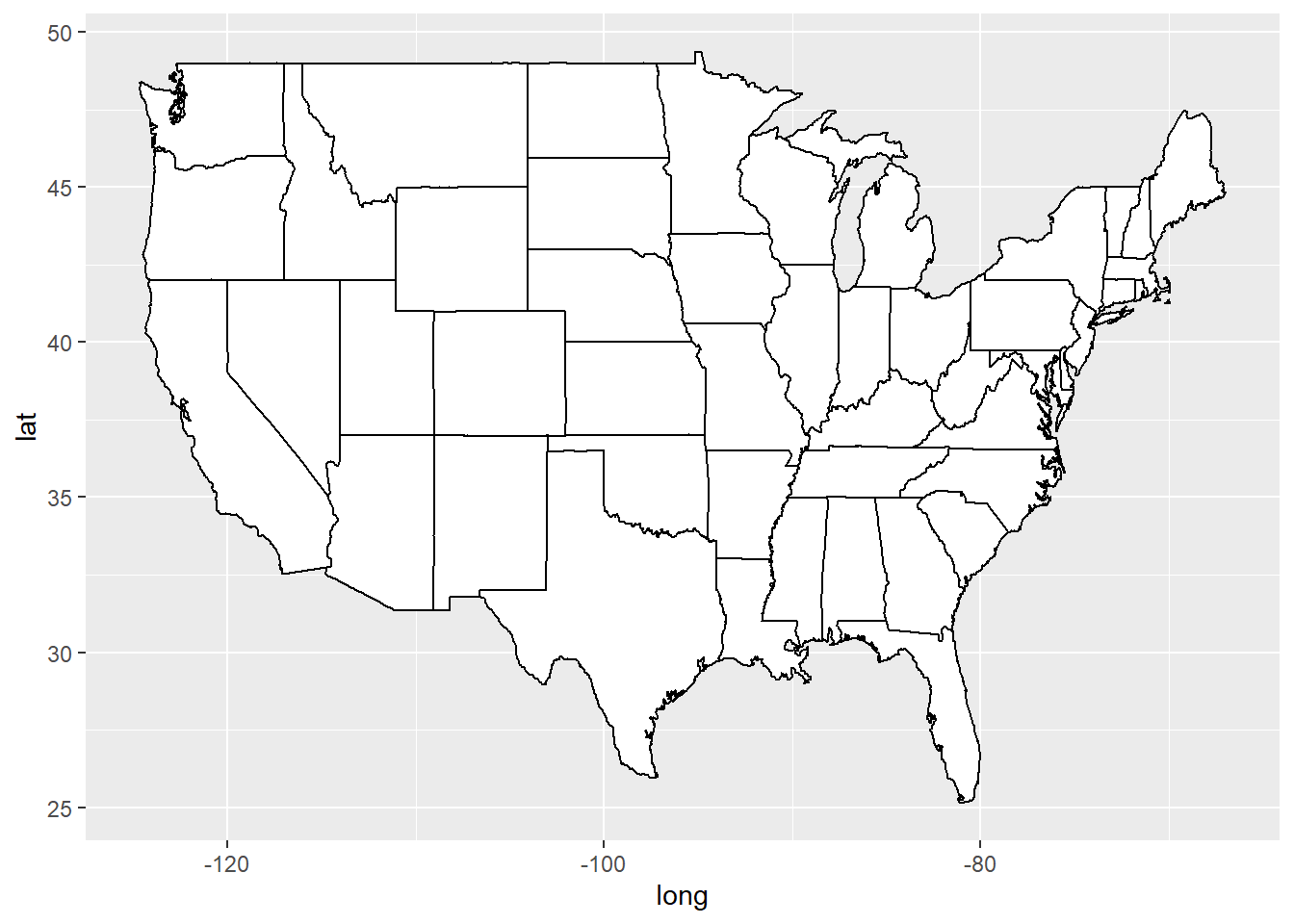
ggplot(states_map, aes(x = long, y = lat, group = group, fill = region)) +
  geom_polygon(colour = "white") +
  guides(fill = "none")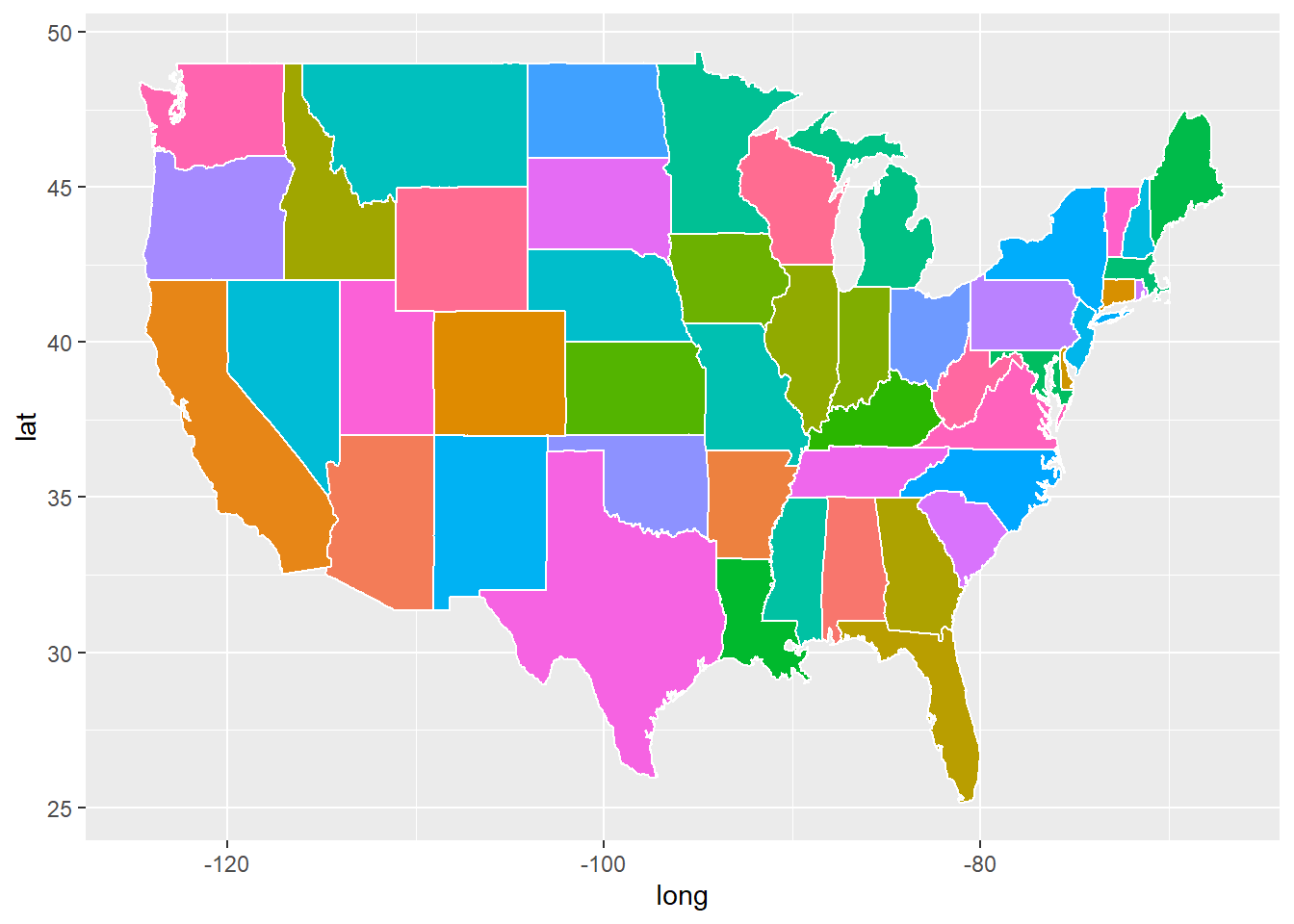
east_asia <- map_data("world", region = c("Japan", "China", "North Korea", "South Korea"))
ggplot(east_asia, aes(x = long, y = lat, group = group, fill = region)) +
  geom_polygon(colour = "black") +
scale_fill_brewer(palette = "Set2") 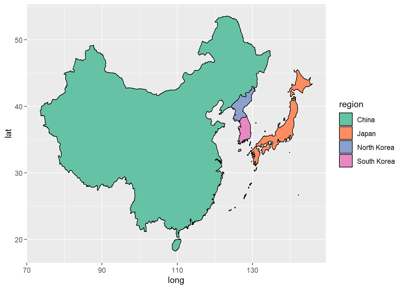
- Third, we continue to create a choropleth map, with regions that are colored according to variable values.
We try to use some crimes data to color the regions in the map.
The crimes data comes from the USArrests dataset included in R.
This data set contains statistics, in arrests per 100,000 residents for assault, murder, and rape in each of the 50 US states in 1973.
crimes <- data.frame(state = tolower(rownames(USArrests)), USArrests)
head(crimes)
## state Murder Assault UrbanPop Rape
## Alabama alabama 13.2 236 58 21.2
## Alaska alaska 10.0 263 48 44.5
## Arizona arizona 8.1 294 80 31.0
## Arkansas arkansas 8.8 190 50 19.5
## California california 9.0 276 91 40.6
## Colorado colorado 7.9 204 78 38.7ggplot(crimes, aes(map_id = state, fill = Assault)) +
geom_map(map = states_map, colour = "black") +
scale_fill_gradient2(low = "#559999", mid = "grey90", high = "#BB650B",
midpoint = median(crimes$Assault)) +
expand_limits(x = states_map$long, y = states_map$lat) +
coord_map("polyconic") 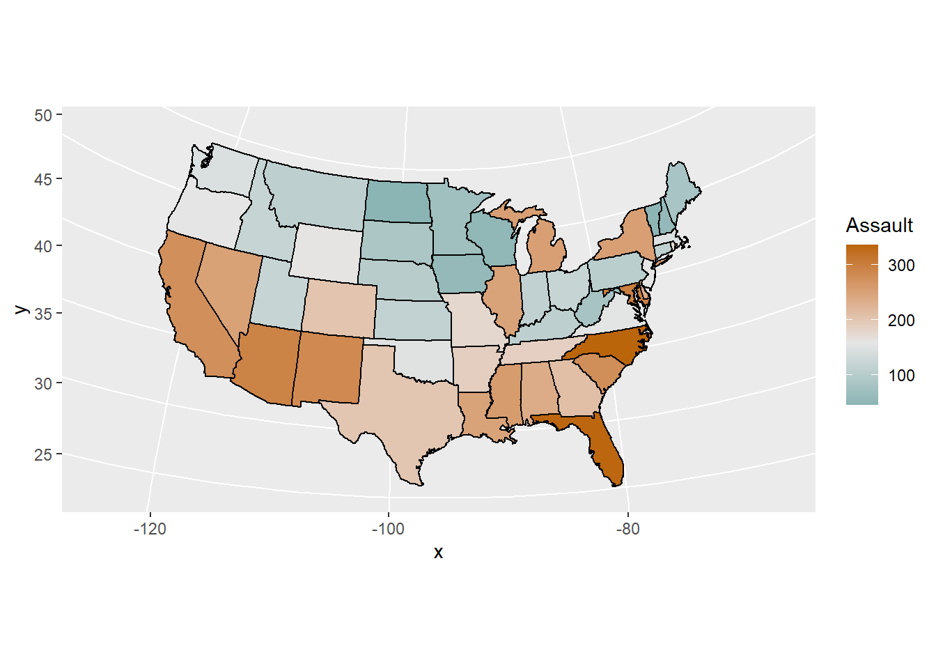
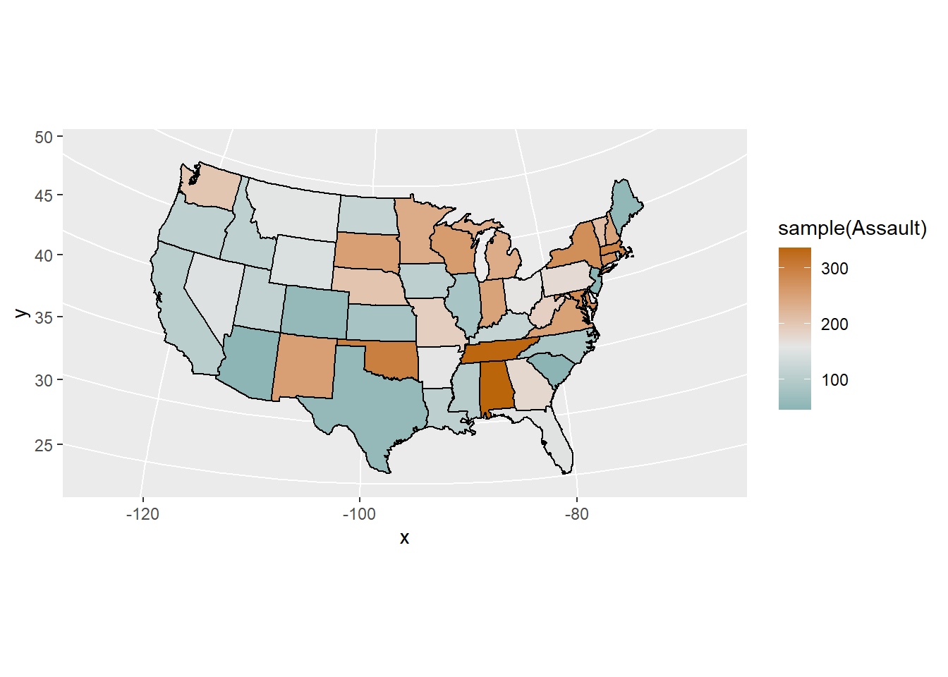
- Last, I want to make an animation to display many maps about assault during different period.
But, I do not have assault data of 50 states for many years.
Because I only want to display the effects of animation maps, so I simply sample the assault data to color the regions.
However, when I write this post, I found this animation, is a gif format graph, can not change, only still.
Notes: This blog is renewed on 2021-11-9, here I use gifski package to display this animation and it can change, great!
for (i in 1:10) {

    print(ggplot(crimes, aes(map_id = state, fill = sample(Assault))) +
            geom_map(map = states_map, colour = "black") +
            scale_fill_gradient2(low = "#559999", mid = "grey90", high = "#BB650B",
                                 midpoint = median(crimes$Assault)) +
            expand_limits(x = states_map$long, y = states_map$lat) +
            coord_map("polyconic"))

  }
Just record, this article was posted at linkedin, and have 342 views to November 2021.